TERMINAL DISPLAY FONT
PROJECT TYPE
DISPLAY TYPEFACE DESIGN
SCOPE
TYPE DESIGN
INSTRUCTOR
DERMOT MACCORMACK
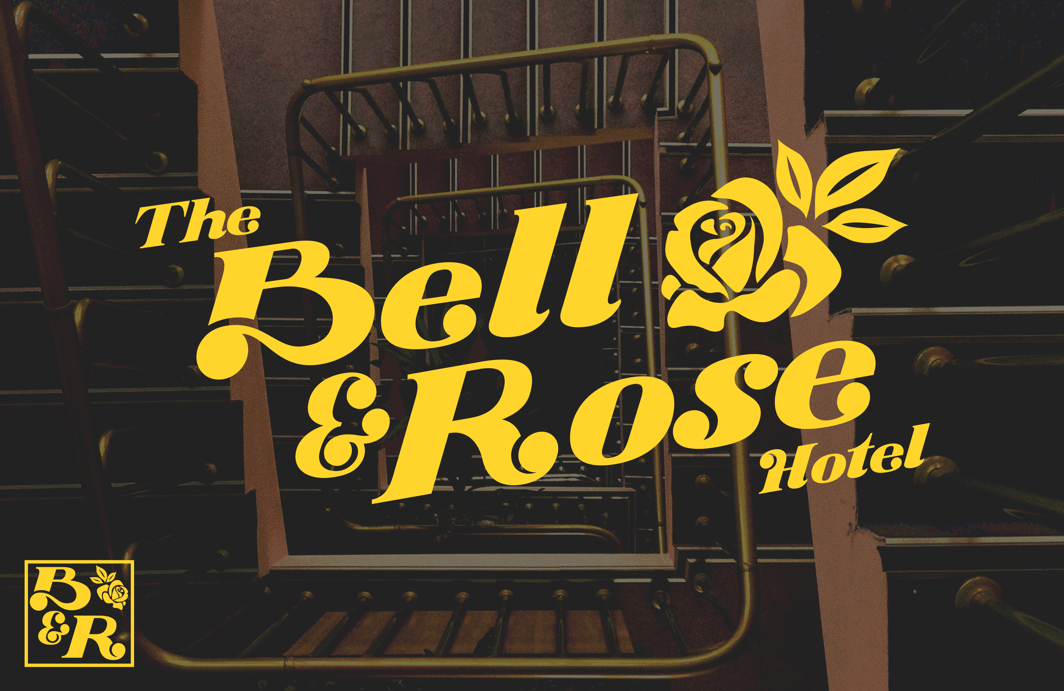
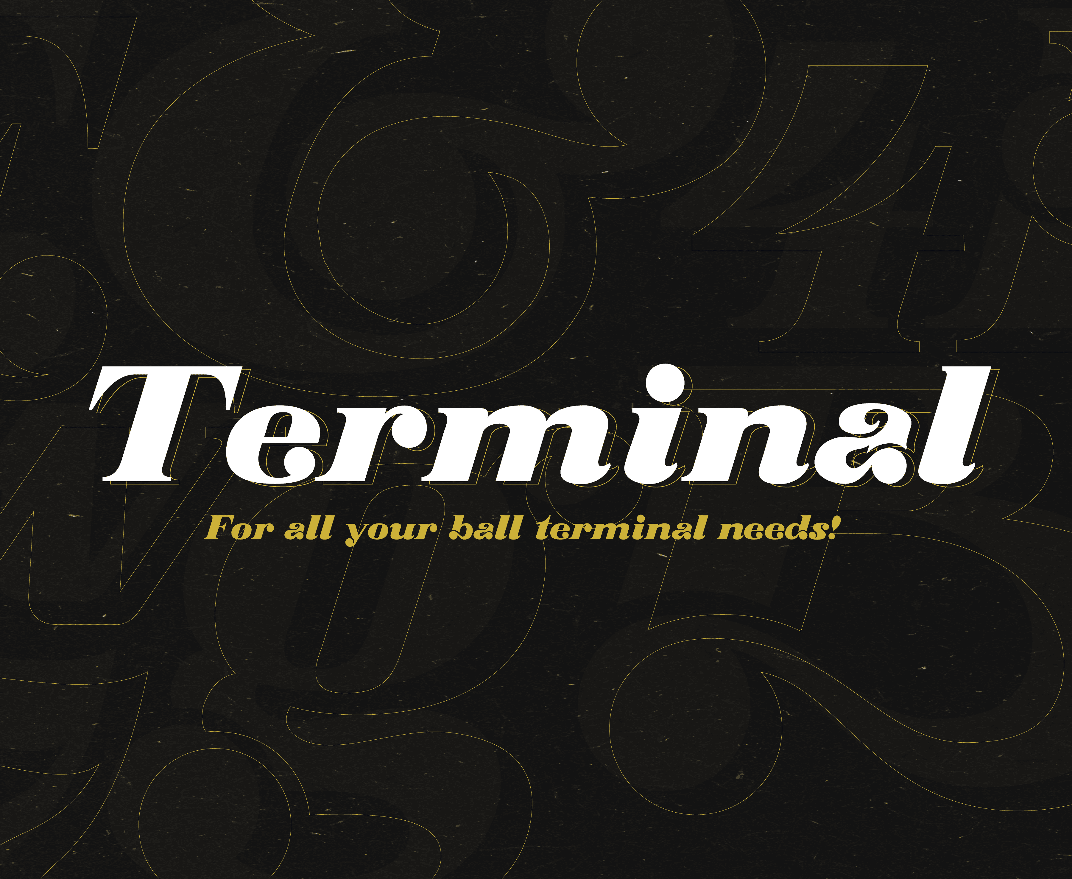
Terminal Display is a high-contrast, italicized display typeface that pays homage to the expressive typography of the 1970s and 80s, channeling the sophisticated energy of designers like Ed Benguiat and Herb Lubalin. The design’s signature element is the looping ball terminal, which provides an elegant, ornamental finish to key letterforms, often cutting them off or nestling itself into the font’s heavy verticals.
The italicized nature of the font contributes to the dynamic motion created by its curves and ball terminals, creating greater emphasis than its non-oblique counterparts, such as Poster Bodoni and Benguiat’s Montage. This juxtaposition of structured contrast, free-flowing curves, and energetic italicization gives the font a timeless flair.

PROCESS
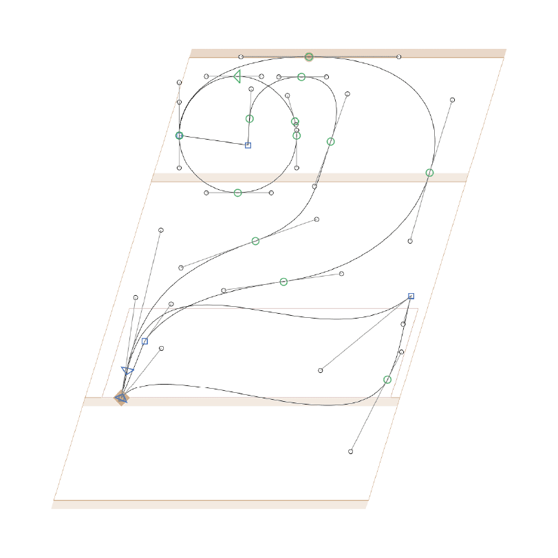
As my first Glyphs project, this piece posed both creative and technical challenges. Taking inspiration specifically from high-contrast or ornamental fonts like Bookman Swash and Poster Bodoni, I began with sketches, testing various widths, contrasts, and terminals. This exploration ultimately led me to the decision of creating an italicized font, which offered even more challenges in creating a unified look and feel. Once a system was identified, the letters were built in Glyphs, where they were visually adjusted and kerned to create an attractive and timeless font that thrives as headlines in publications and brand systems alike.