PHILADELPHIA PHOENIX REBRAND
PROJECT TYPE
SPORTS BRANDING
SCOPE
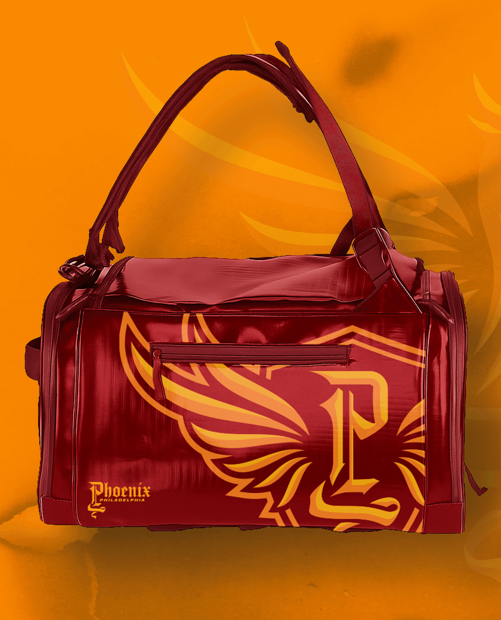
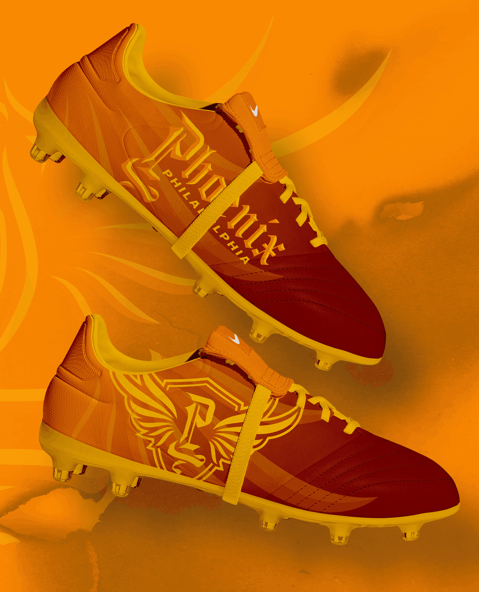
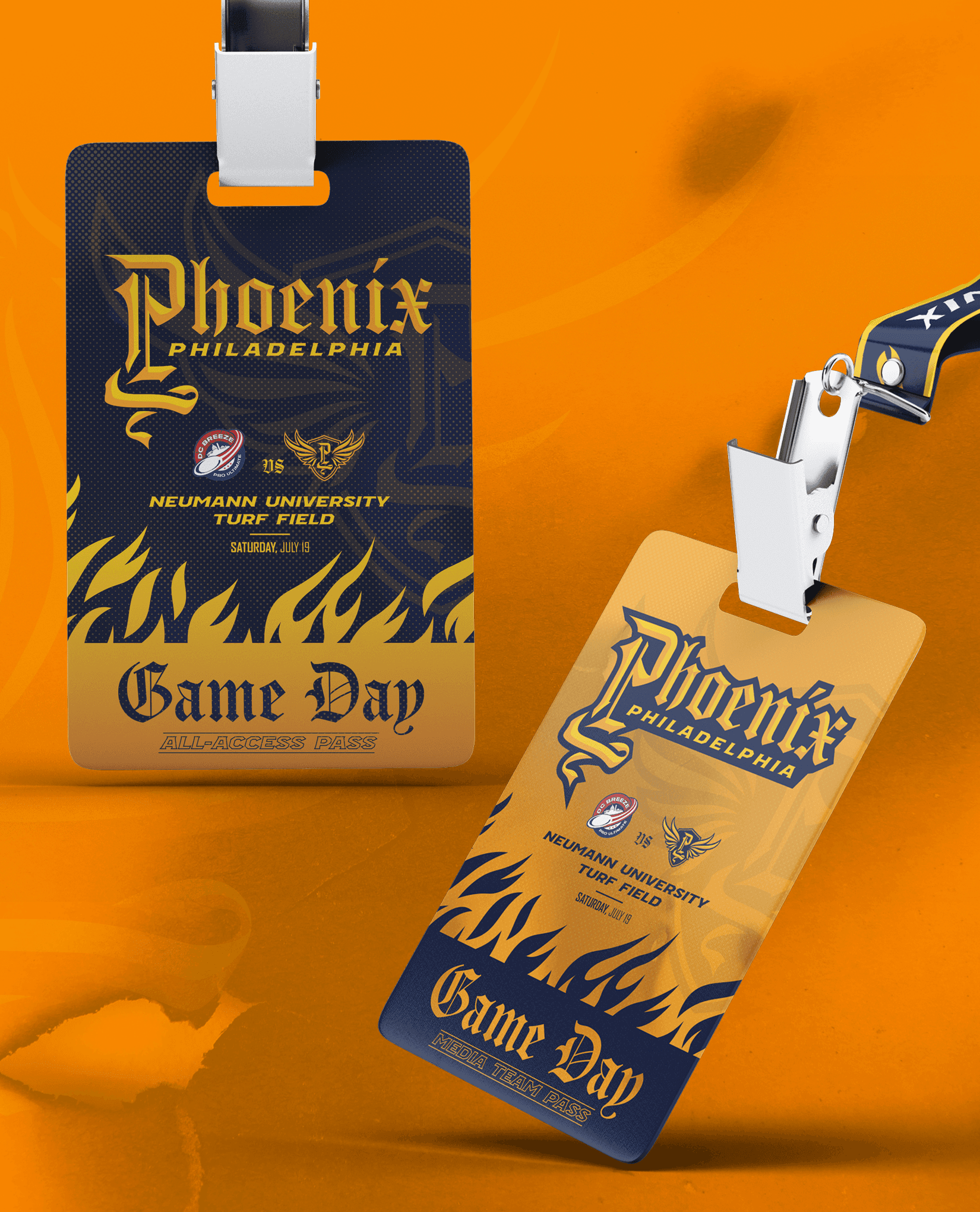
BRANDING
LOGO DESIGN
TYPE DESIGN
ENVIRONMENTAL DESIGN
INSTRUCTOR
JOE BOSACK
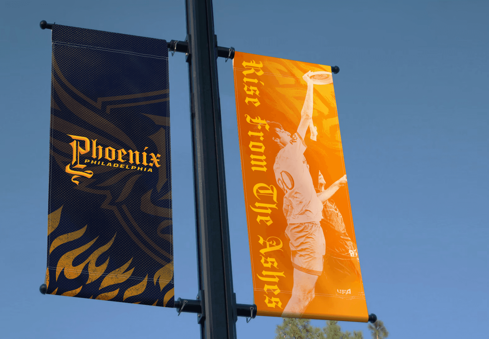
The Philadelphia Phoenix represent Philadelphia in the Ultimate Frisbee Association (UFA), the open professional league of Ultimate Frisbee. Originally the Philadelphia Spinners, the team left its original league, the AUDL, for the MLU in 2013 and ultimately disbanded after a decline in Philadelphia professional frisbee. From that downturn, the Phoenix were born, filling the void and giving the city a new symbol to rally behind.
Rising from the ashes of the Spinners’ departure, the Phoenix name reflects the team’s origins and the history of resilience and reinvention in Philadelphia as a whole. Today, the Philadelphia Phoenix stands as both a continuation of the city’s professional ultimate legacy and a symbol of its unbreakable drive to rise again.

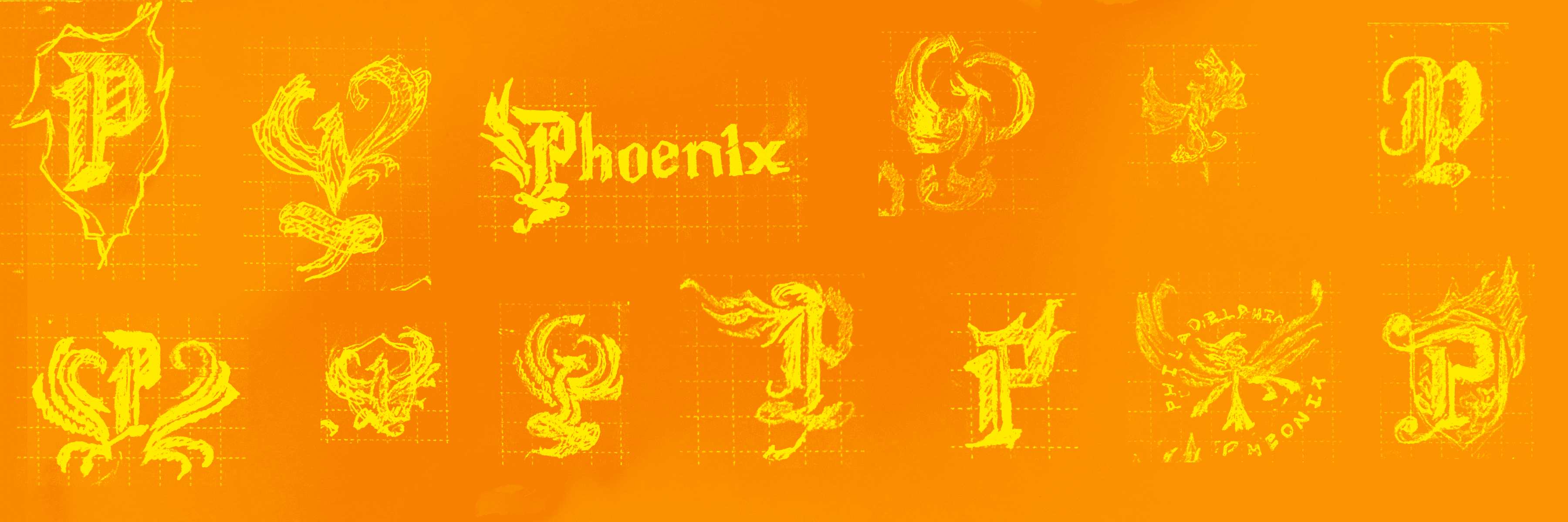
PROCESS
Beginning with sketches inspired by sharp calligraphy, emblematic birds, and medieval crests, this brand system embodies the sharp contrast between legacy and modernity through its gothic lettering and sleek iconography. The final system not only connects the Philadelphia Phoenix with Philadelphia's history of resilience, reinvention, and revolution, but also communicates a sense of fire, passion, and competitive intensity that reflects both the Phoenix name and the spirit of Philadelphia sports culture.